Easier Workflows,
Better Scanability
Global Gas Monitoring Service
Project
Customer
GDI Solution Co., Ltd.
Team
Suwan Cho,
Developer
Soyeon Lee,
Product Designer
Scope
Initial concept to final design
Timeline
10 Weeks
Tool
Figma
My Role
#
Product design
#
UX/UI desgin
#
User interview
#
User survey
#
Design system
#
Usability test
#
Design iterations
Overview
BELLCLOUD: Industrial gas detection & monitoring service
BELLCLOUD is a web-based solution for real-time gas leak monitoring. Our client, GDI Solution, launched it for remote device control, but the initial version suffered from a complex UI and poor readability. To solve these issues, I collaborated with a lead developer and another product designer to completely redesign the system.
Simplifying device connectivity and establishing visual hierarchy to reduce monitoring time
BELLCLOUD connects to gas detection devices in two ways: via Bluetooth or a dedicated cradle, allowing users to monitor gas levels. We streamlined the connection process by displaying only the essential buttons for each step, reducing unnecessary cognitive load. Furthermore, by creating a clear visual hierarchy for large datasets, we successfully reduced the overall time required for monitoring.

Discover
Problem Definition
01 Complicated Connection Flow
Users fail to find the two connection buttons within the first few seconds, making it unclear how to connect or if they are successful.
Secondary buttons are displayed on the initial screen too early, hindering the primary connection process. To fix this, users must be able to identify the correct button within a second of entering the screen. Once connected, they need to immediately verify the connection status, method, and the specific device.
Unnecessary buttons on the initial screen delay user actions
Some buttons are only needed after a successful connection but are visible from the start, hindering the workflow. For example, during a cradle connection, users must link the cradle first before clicking "Load Device" to connect the equipment. Showing this button on the initial screen serves no purpose. Similarly, actions like switching or disconnecting devices are only needed after a connection has been established.

As-is: Device configuration screen with unnecessary buttons
02 Lack of information hierarchy
Settings and data are dense with text, making it difficult to find critical information at a glance.
A lot of settings must be shown on one small screen, so the text size has to stay small. However, it is hard to tell the difference between titles, values, and the current settings. Because of this, we needed to create a better layout with a clearer text order, while using simple icons and colours.
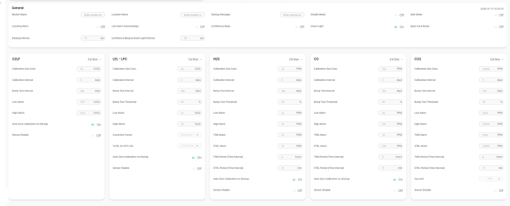
As-is: Device configuration screen with no hierarchy
In the Monitoring screen, users need to see safety alarm titles and status info within one second. Also, important information must look the same on every screen. To do this, we decided to make every small part into a component to keep everything consistent.
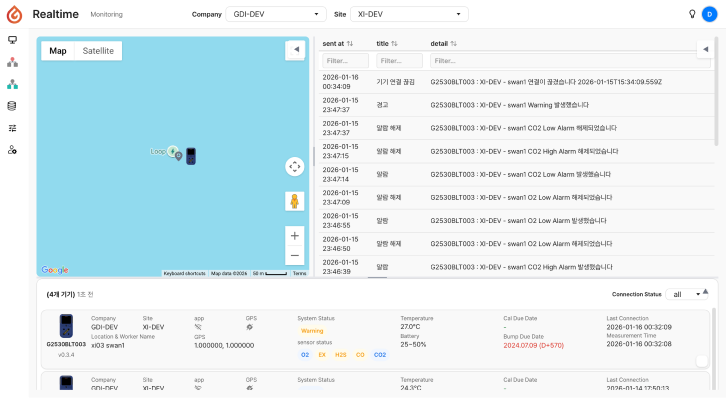
As-is: Realtime monitoring screen with inconsistent UI elements
Design Outcome
Revamp 01
Designing an Intuitive Connection:
Displayed only the buttons needed for each step, and activate conditional buttons only when necessary.
As-is: Device configuration - Connect UI

As-is

The two connection methods, Cradle and Bluetooth, are not clearly shown.
Buttons that are only needed later are visible from the start, causing confusion.
All buttons are listed on the first screen with no hierarchy, making them hard to find.


To-be: Connect UI

To-be
Displayed only the two key buttons (Cradle and Bluetooth) on the initial screen
Exposed buttons progressively based on each step, guiding users intuitively to the next action.
Isolated the 'Apply Setting to Device' button on the right side to clearly signal the final step. (see image below)
As-is: Device Configuration Screen

To-be: Device Configuration Screen
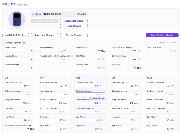
Reviewed the entire connection process from a user’s perspective to design a compact and intuitive UI for each step.

Connect Work Flow

Flow on UI
Turned every detail into atomic components to enable UI reusability across pages, whilst creating extended variables for effortless developer handovers.

To-be: Connect components for scalability
Design Outcome
Revamp 02
Clear & Intuitive Information Hierarchy:
Improved the visual hierarchy using icons and meaningful colour chips, so users can monitor safety status information within seconds.
As-is
Users do not know what to look at first on the monitoring screen.
Safety status is only shown in text, making it hard to find dangerous situations quickly.
It is also hard to tell which information is important in the device list.
As-is: Realtime Monitoring Screen
To-be
Clearly separated sections for location, alarms, and device lists with distinct titles.
Applied colour chips for safety status, ensuring the red danger status is noticed first.
Placed data items in the table header and used icons for battery and connection status to make them stand out.

To-be: Realtime Monitoring Screen
Atomic design system for consistency and scalability
Managed status icons as components to ensure they appear identically across all screens.
Applied these components in unified or extended forms throughout all necessary pages.
Structured the system with design tokens—such as colour, spacing, font, radius, and border—based on Base and Semantic standards.

Status Components

Component-based Device List and Details

Unified design token architecture: base & semantic color system

Unified design token architecture for space, font, radius, and border
Limitations & Suggestions
In safety management services, preserving users’ existing mental models is more important than achieving logical perfection
After analyzing the service flow, we found that some menu structures and terms were not logically consistent. For example, some menus were grouped by their function, while others were grouped based on their usage conditions, such as whether they required a real-time connection.
To fix this, we proposed a new side menu bar with systematic grouping to make the structure clear at a glance. However, on-site users found this new structure unfamiliar, which actually caused confusion when they tried to find specific menus. As a result, the client chose a layout that prioritises actual tasks over a logical understanding of the service.
Design Proposal
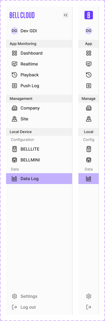
Design Proposal
To create a clearer and more consistent structure, we reorganized the menu items based on the nature of each task. We grouped real-time control features under “App Monitoring” and offline device-based features under “Local Device.” Management functions were independent of the connection type, so we grouped them separately.
Client’s Choice
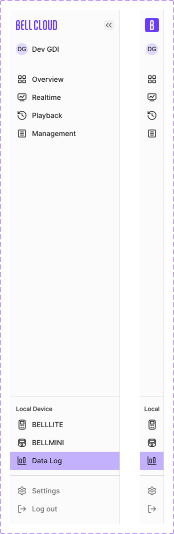
Client’s Choice
However, the logically structured and more detailed grouping we proposed made the interface feel more complex to actual users. In the gas monitoring industry, Workers tend to think in terms of two simple task types: monitoring that requires a real-time connection and device management that does not (offline). Feedback suggested that clearly separating the two immediate tasks is easier to use than a menu that explains the overall logic and structure of the service.
I’m happy to chat!


Designed by Dohee Han © 2025 All Rights Reserved.
Copied!